The Hidden Power of What Isn’t There
In painting, what you don’t see is often just as critical as what you do. Negative space those untouched or empty areas around and between objects has moved from being a passive backdrop to an active force in composition. It’s quiet but not silent. It demands attention without flashing lights.
Over the last decade, contemporary painters have shifted their perspective. Busy canvases gave way to breathing room. Instead of crowding visual space, artists began pulling back. The result: viewers lean in, mentally filling the gaps. Spatial awareness matured. Instead of simply placing forms, creators now sculpt the voids around them just as intentionally.
This evolution links closely with the rise of minimalism and abstraction. In practice, these movements trust viewers to do more interpretive work. They resist over explanation. A single brushstroke in a sea of white can carry more emotional weight than a dozen figures fighting for attention. Emptiness becomes form. Lack becomes message.
In 2026, mastering negative space isn’t just an aesthetic choice it’s a statement. When used well, it can shift tone, create tension, and make the seen and unseen share equal ground.
Reading Between the Lines: How the Eye Interprets Space
Emptiness isn’t empty. Our brains are wired to notice gaps, patterns, and contours. When we see blank space, our perception kicks in, trying to make sense of what isn’t there. That’s the power of negative space it pulls attention without asking for it. It creates tension, then invites us to resolve that tension ourselves.
Painters use this to their advantage. Instead of guiding the eye with detail, they use visual tension: a single marked area surrounded by void, an abrupt stop in form, or a composition that feels suspended. Viewers lean in. The space between objects starts to matter more than the objects themselves. It’s psychological. The eye looks for meaning, and absence gives us the job of finding it.
Take contemporary artists like Julie Mehretu or Liu Xiaodong. Mehretu layers chaotic microstructures and then carves out vast swaths of openness it’s architectural dissonance, and the silence in her work is deafening. Xiaodong, known for immersive realism, sometimes places figures off balance against sparse environments, leaving large parts of the canvas naked. Presence begins where the form stops.
In short: the best artists don’t just paint what’s there they paint what’s not.
Techniques for Harnessing Negative Space
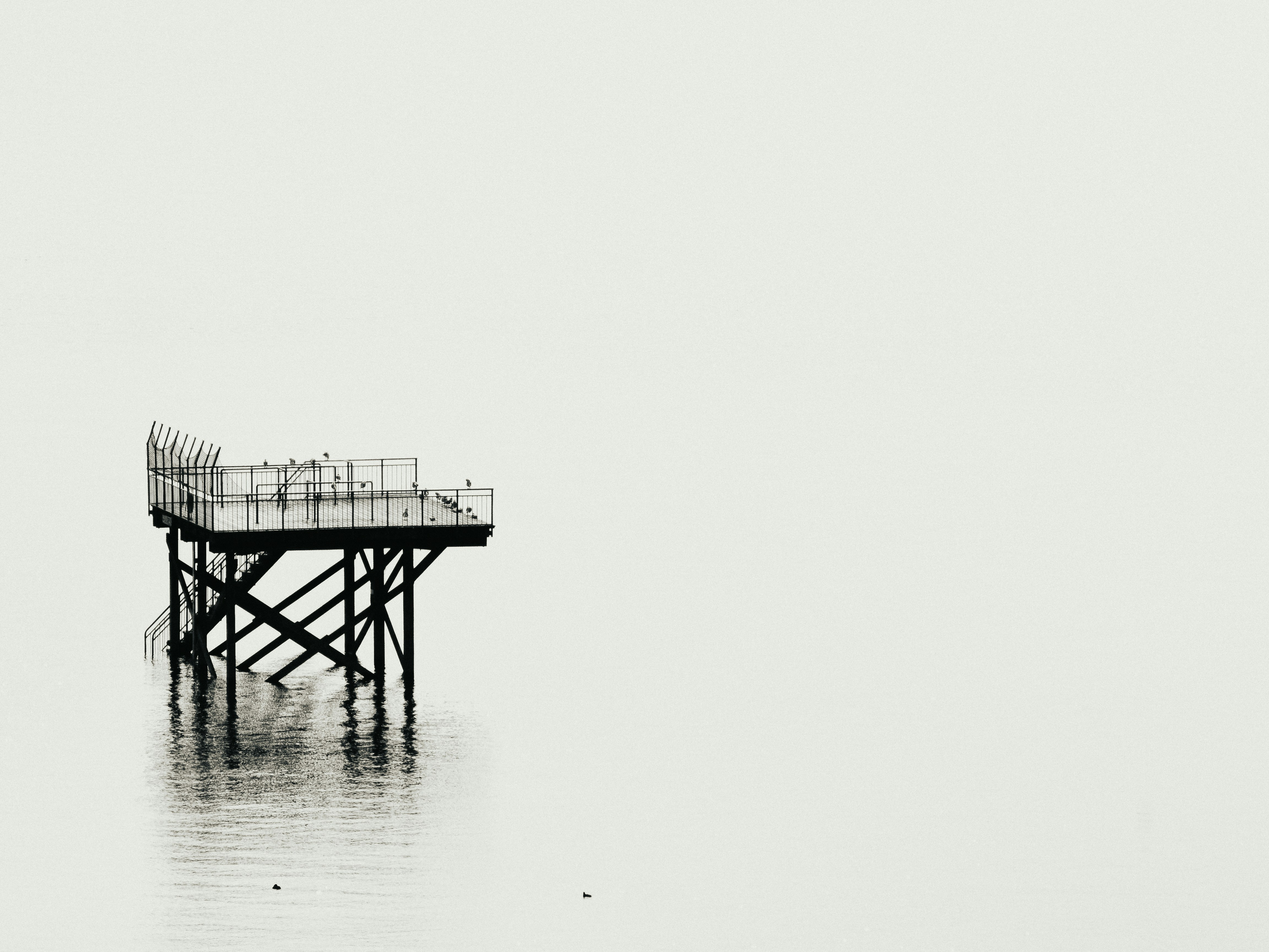
Knowing when to let your canvas breathe isn’t just a stylistic choice it’s tactical. Space gives meaning to content. Whether you’re working in acrylics or layering digital textures, the moment you stop filling every inch of your frame is the moment you allow real focus to happen. It’s about restraint. Letting silence carry weight.
Contrast is your next weapon. Sharp edges against voids. Dark beside light. When orchestrated deliberately, that push and pull guides the eye and triggers emotion. A well placed blank area can hit harder than a splash of color ever could.
Clutter kills clarity. In mixed media and complex compositions, the temptation to overstate is everywhere more texture, more layers, more movement. Step back. If every element is shouting, nothing gets heard. Create breathing room around key forms. Don’t make the viewer work so hard.
Texture also plays quiet roles in anchoring negative space. Smooth next to rough, dense near empty it’s all about visual rhythm. Depth isn’t always built by addition. Sometimes texture enhances a space simply by what surrounds it or what doesn’t. For more on that balance, check out How to Use Texture to Create Depth in Your Artwork.
Negative Space in Practice: Styles and Mediums
Not all painting techniques treat empty space the same. Oil painting, with its slow drying nature and rich layering, tends to build around voids intentionally. Artists can carve out space by omission, letting underpainting or bare canvas breathe through dense textures. In contrast, acrylic’s fast drying forces quicker decisions. Most acrylic painters working with voids rely on bold blocking clear, declarative spaces left untouched to balance heavy color or line work. Digital, meanwhile, is its own beast. The undo button makes risk taking with negative space far less perilous. Many digital artists are pushing emptiness to the extreme, redefining composition with flat tones, stark contrasts, and unconventional framing.
Flash forward to 2026, and a number of names stand out for their minimal style impact. Lora Ishigawa’s digital monoprints strip down urban landscapes to hard horizons and emptiness 70% colorless sky, 30% suggestion of structure. Marc Thomley works in acrylic, known for letting more than half the canvas stay raw, which turns his bursts of color into focal points rather than backgrounds. Oil artist Bernard Reuve’s subtractive series erases rather than adds he paints, scrapes, paints again, leaving visual fossils of ghost structures within space.
Contemporary galleries are catching on. The market’s cluttered with loud, maximalist work so when silence enters a room, people notice. Minimal spatial composition is seen not as empty, but considered. Critics talk less about what’s included and more about what’s deliberately withheld. And in a time where attention is tight and minds are full, artists who communicate through less are commanding more respect.
Making the Most of Less
Training your eye for spatial balance isn’t glamorous, but it’s essential. Start by stripping things down. Take one of your old works and remove half the visual elements. What remains? Where does your focus go? This act of controlled subtraction tells you a lot about how space carries weight.
Another exercise: draw five objects on a blank canvas and force yourself to place them with as much intentional space between them as possible. No clustering. No fillers. Then step back and assess the rhythm. Does the composition breathe? Or does something still feel off balance?
Next, shift your mindset from layout as decoration to layout as narrative. Each element has a reason to exist or it doesn’t. Plan your compositions like a set designer. If an area is empty, it isn’t a mistake it’s part of the conversation.
Finally, there are moments when negative space becomes the star. In these instances, the blankness isn’t backing up a shape; it is the shape. A void can spark emotion, create tension, or carry a message louder than form. The trick isn’t just knowing where to add it’s knowing, with purpose, where not to.
Final Thoughts: Precision Over Excess
In 2026, restraint isn’t playing it safe it’s speaking with purpose. The best painters aren’t just filling space. They know when to leave it alone. Negative space isn’t absence; it’s intention. It says: here’s where breath belongs. Here’s where the viewer pauses.
That kind of control doesn’t come from guesswork. It comes from experience, trust in silence, and knowing that cramming more into a canvas doesn’t make it better. It just makes it louder.
Professionals know this. Hobbyists often don’t. The difference is in the willingness to delete what doesn’t need to be there, to strip an idea down to its weight bearing lines. Less becomes not just more it becomes everything.
So keep asking yourself the only question that matters when you’re stuck: what can you take away to make what remains stronger?
 Jessica Elsassie has opinions about inspiration and ideas for artists. Informed ones, backed by real experience — but opinions nonetheless, and they doesn't try to disguise them as neutral observation. They thinks a lot of what gets written about Inspiration and Ideas for Artists, Art Collecting Tips, Artist Profiles and Interviews is either too cautious to be useful or too confident to be credible, and they's work tends to sit deliberately in the space between those two failure modes.
Reading Jessica's pieces, you get the sense of someone who has thought about this stuff seriously and arrived at actual conclusions — not just collected a range of perspectives and declined to pick one. That can be uncomfortable when they lands on something you disagree with. It's also why the writing is worth engaging with. Jessica isn't interested in telling people what they want to hear. They is interested in telling them what they actually thinks, with enough reasoning behind it that you can push back if you want to. That kind of intellectual honesty is rarer than it should be.
What Jessica is best at is the moment when a familiar topic reveals something unexpected — when the conventional wisdom turns out to be slightly off, or when a small shift in framing changes everything. They finds those moments consistently, which is why they's work tends to generate real discussion rather than just passive agreement.