What Texture Actually Does for Your Art
Texture isn’t just an aesthetic choice it’s a directional tool. The viewer’s eye is naturally pulled toward areas with contrast, rhythm, and irregularity. Think of texture like topography; it tells your audience where to move, slow down, or stop completely. When used with intention, rough patches, smooth zones, and layered strokes guide attention across the canvas the same way a map shapes a journey.
On a flat surface, texture breathes life in where there is none. A well placed brush drag or palette knife swipe adds dimensionality, making the illusion of form feel tangible. It tricks the brain into thinking a two dimensional space has depth, without needing actual shadow or perspective. That’s the quiet power of good texture it rewrites the rules of flatness.
Then there’s mood. Texture speaks louder than most think. Jagged edges, soft fades, gritty buildups they all hit differently. Rough textures can evoke tension or unrest. Smooth ones can bring calm or clarity. It’s less about the style and more about the emotional residue each stroke leaves behind. Used well, texture doesn’t just show you something it makes you feel it.
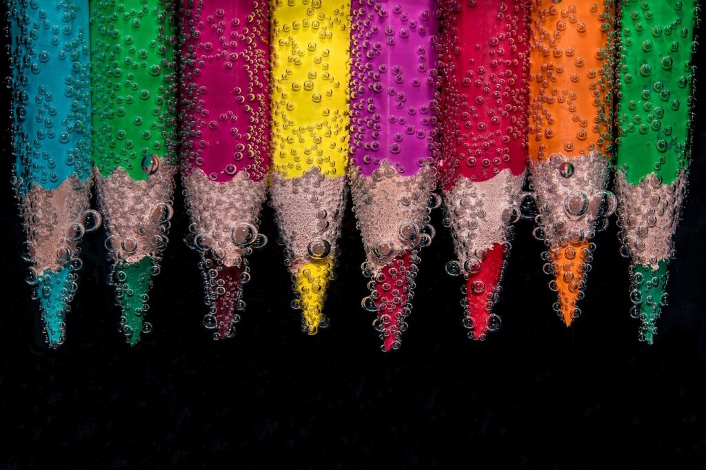
Types of Texture: Visual vs. Tactile
Texture isn’t just about how something feels under your fingers it’s also about how it tricks your eyes. Visual texture is all about perception. With the right stroke, pattern, or contrast, you can make a flat surface appear rough, soft, cracked, or slick. Hatching, stippling, dry brushing these tools don’t add bulk, but they do add presence. They guide the viewer’s eye across the canvas and suggest physicality where there isn’t any.
Tactile texture plays in another league. This is the real deal thick paint ridges, layered collage, sand, tape, cloth, modeling paste. It’s what you run your hand over and feel resistance, softness, crumbling edges. Tactile work connects the viewer with the piece in a physical way even if they’re only looking.
The real magic happens when you bring the two together. Visual texture offers illusion; tactile texture confirms it. Mixing both creates depth that’s not only seen, but sensed. That’s the kind of layered storytelling that lingers where your piece doesn’t just look real, it feels it. If your aim is to pull people deeper, seamlessly blending these two approaches is how you get there.
Techniques That Add Depth
Texture isn’t just visual noise it’s structure. It’s what makes a surface feel alive. These four techniques bring dimension, complexity, and movement to your work without relying on hyperreal detail.
Dry brushing is the minimalist’s answer to surface interest. With just a trace of pigment on the brush, drag it lightly across a primed or painted area. This leaves broken, irregular marks that sit on the surface, catching the eye and creating tonal shifts that hint at form without spelling everything out. Keep it loose. Keep it subtle.
Impasto speaks in the loudest volume. This is thick application palette knife or brush where the paint physically stands off the canvas. It’s not just about texture; it’s about shadow, structure, and rhythm. Impasto lets light do the talking, casting tiny shadows and building actual topography into your piece.
Sgraffito and scraping take a subtractive approach. Apply a layer of opaque or contrasting color, and while it’s still wet, use the tip of a palette knife, the end of a brush, or even a toothpick to scratch through, revealing what’s underneath. It’s sharp. It’s raw. And it adds clarity and edge in a sea of quiet texture.
Finally, glazing is where you tie it all together. Thin, translucent washes layered over texture soften edges and adjust hue without sacrificing the physical qualities beneath. It’s how you guide emotion warm things up, cool areas down, or create harmony between aggressive strokes.
These aren’t just tricks. They’re decisions. And when applied with restraint and intention, they turn a flat surface into something that breathes, shifts, and stays with the viewer.
Choosing the Right Medium
When it comes to working with texture, oil and acrylic paints behave in fundamentally different ways and the choice between them changes how you build depth.
Oil paints are slow to dry. That gives you time to push, pull, and shape the paint, layering confidently without worrying about abrupt drying lines. The density of the pigment loads in oils allows for rich color even when applied thick with a palette knife. This makes oils ideal for impasto techniques, where you want thick ridges and peaks of paint to hold their shape and reflect light.
Acrylics, on the other hand, dry fast. That speed can be frustrating or a superpower, depending on your workflow. You can build layers rapidly, which is great for artists who like to work in sessions or evolve a composition quickly. But once it sets, it’s set. If you’re aiming for a lot of blending or subtle transitions in textured areas, you’ll need to work fast or use retarders to extend drying time. Acrylics typically have a lower pigment load than oils, so if you’re working thick, you may need multiple passes for full saturation.
Both mediums take to texture, but in different ways. Oils are more forgiving and malleable; acrylics are more efficient and direct. Your approach to layering and finish should reflect that.
For a deeper breakdown of technical and stylistic differences, check out Comparing Oil vs. Acrylic Which Medium Works for Your Style.
Tools to Enhance Texture
The tools you choose aren’t just about application they’re collaborators in the texture story you want to tell. From traditional implements to unconventional materials, thoughtful tool use can introduce powerful layers of depth, contrast, and emotion into your artwork.
Traditional Tools That Make a Difference
Some of the most impactful textural effects start with classic tools. Learning to manipulate these with intention is key:
Palette knives: Ideal for bold strokes, raised edges, and scraping away layers for contrast
Brushes: The bristle type and condition (worn or stiff) drastically affect the final texture
Sponges: Great for organic forms, soft transitions, and non linear surface texture
Mixed Media for Unexpected Results
Combining traditional painting methods with other media can dramatically boost textural interest:
Layer pencil or charcoal under or over paint for fine contrast and variation
Incorporate ink, collage, or thread for multidimensional storytelling
Fuse drawing with painting for a controlled but textured look
Modeling Paste and Gel Mediums: Use With Intention
Texture isn’t just about applying paint it’s about transforming the surface itself. Modeling paste and gel mediums can drastically change how your paint behaves.
Modeling paste: Thick and heavy, perfect for creating sculptural elements, knife work, and foundation texture
Gel medium: Adds transparency or translucency, and can be used to embed objects in the surface
Apply in layers or pair with stencils for reoccurring texture patterns
Found Materials: Bringing the Unexpected On Canvas
Everyday materials can unlock surprising depth and authenticity:
Sand: Mixed into paint or glued to surface, adds a grounded, gritty texture
Fabric: Gauze, canvas, or burlap can be layered into the work for tactile effect
Paper: Torn edges, layering, or wrinkled pieces provide visual and physical variation
Use these materials not for novelty, but to support your artistic intent. When thoughtfully integrated, texture elevates a flat surface into something immersive and dimensional.
Modern Texture Applications in 2026
For digital artists, simulating real world texture isn’t just a flex it’s a foundational skill. Gone are the days when flat, airbrushed renders were enough. Today’s work demands digital grit: faux wood grain that looks splintered, cloth that reads like it would bunch in your hand, skin with pores and stretch and life. Artists achieve this through high res scans of real materials, custom texture brushes, and layering techniques in software like Procreate, Blender, and Substance Painter.
Mixed reality exhibits are pushing things further. We’re seeing galleries where textured visuals respond to motion or light, creating surface illusions that shift as you walk by. It’s not just about realism it’s about immersion. 3D textural mapping helps build environments that feel tactile, even when you can’t touch them.
Texture has also become a kind of signature. Contemporary digital artists are leaning into texture as identity glitchy noise, painterly strokes, gritty overlays elements that make their work instantly recognizable in a sea of content. Whether gritty or sleek, texture isn’t just decoration. It’s voice, it’s depth, and it’s very much the future.
Final Tips for Creating Depth That Lasts
Think of every layer as a decision. Don’t slap down marks just to fill space. Each stroke should do something reinforce form, add contrast, or enrich the overall rhythm of the piece. Mindful layering takes more time, but it builds visual weight that resonates beyond the surface.
Always start from the background. Build in stages, letting colors, forms, and textures stack forward. This keeps your depth believable and your composition clean. Rushing to foreground details too soon can flatten everything else.
Now light. Think of it as a sculptor’s chisel. Highlights and shadows, when placed with intention, make even dry brush marks or palette knife smears feel alive. It’s not about adding more it’s about placing light where it earns its keep.
In the end, your surface shouldn’t just support the image it should speak. Texture tells stories before the viewer even knows what they’re seeing. Use it loud or soft, all that matters is that it means something.